

Michael J. Bazdarich, PhD
Product Specialist/Economist
KEY TAKEAWAYS
- Yield curve inversions have an excellent track record of predicting every US recession since the 1960s.
- One of the reasons the exact definition of yield curve inversion is so hotly debated is that no one really understands exactly why curve inversions have fared so well as recession predictors.
- The yield curve inversions that preceded previous recessions were cases where the yield curve clearly looked inverted. That is not the case presently.
- Our preferred measure of yield curve inversion concerns the spread from overnight rates to long bond yields. This measure is not inverted presently.
- While the 10-year/3-month spread has indeed correctly predicted every recession since 1960, so has the long-bond/overnight measure.
- The yield curve is currently flat enough that a few more Fed rate hikes or a further, sharp rally in T-bonds could push it to a true inversion. Fed rate cuts this year could prevent such a true inversion from occurring.
When 10-year Treasury note yields fell below the 3-month Treasury bill rate earlier this year, there was a rush to proclaim yield curve inversion. That rush was reminiscent of the clichéd story of a family drive, enshrined by “The Simpsons.” Homer is driving the family to some destination, while Bart and Lisa incessantly ask him “Are we there yet?” Homer grows increasingly frustrated, but what can he do? He can’t just dump them out of the car in the middle of nowhere….or can he?
Similarly, over recent decades, yield curve inversion has garnered more and more attention as a recession indicator, to the point that analysts have fallen over each other recently to be the first to declare the yield curve inverted. Part of the issue is which yield curve measure is the correct one: 2s to 10s, bills to 30s or what? Researchers at the Federal Reserve Board of San Francisco (FRBSF) and others have worked long and hard on this, and everyone has their own opinion. We ask a more basic question: does the curve look inverted? To most people’s eyes, it still doesn’t, even with the further declines in term yields seen in recent weeks.
In this piece, we’ll work through a lot of yield curve history and theory—or non-theory. But we start with the basics. The yield curve inversions that have preceded every recession of the last 50 years were cases where the yield curve clearly looked inverted. Not just were 10-year yields below T-bill yields, but almost every longer-maturity yield was below almost every yield of shorter maturity. The curves might not always have been uniformly downward sloping, but they were downward sloping over most of their runs, and even at the longest maturities, yields were well below those at the short end. We don’t have that presently.
Exhibit 1 summarizes things in a single graphic. It shows the current yield curve (as of June 18, 2019) against the most pronounced curve inversions occurring before almost every recession since 1960. The yield curve prior to the 1981 recession was excluded simply because it was so sharply inverted—19.1% fed funds rate versus 12.1% 30-year yield—that it would overwhelm the scale of the chart if it were included.
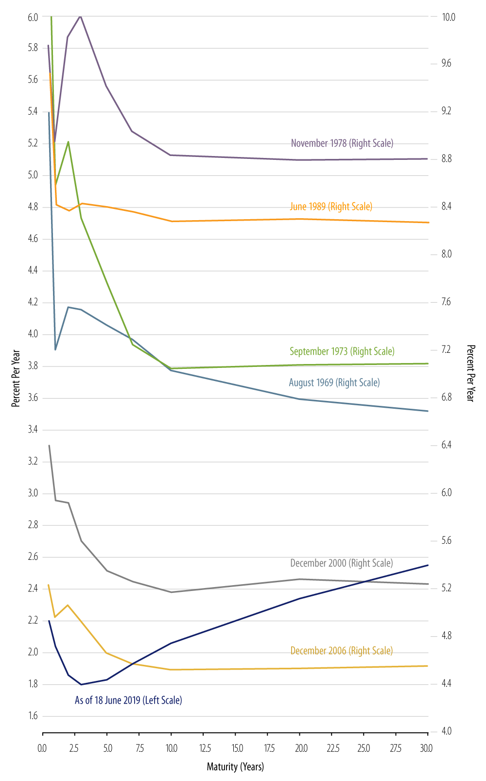
In the previous inversions shown in the chart, the curves take on some funky shapes, but they all at least look downward sloping. Even the curve of November 1978 features its “bumps” between 3- and 12-month maturities, with the curve uniformly downward sloping thereafter. The inversions of 2000 and 2006 had “bumps” between 10- and 30-year yields, but a clear downward slope from funds to 10s, and 30s were well below short rates, either the fed funds rate or T-bill yields.
Contrast that with the present curve. There is indeed a dip from 1s to 3s, but the curve is then sharply upward-sloping from 3s to 30s to an extent not seen in any pre-recession inversion episode. Overall, the curve does not look downward sloping (inverted). If one programmed a computer to fit a single straight line to best typify the curve, that line would be upward sloping. In all previous, actual examples of inverted curves, such a straight-line fit would clearly be downward sloping.¹
Things can change, and we may see a truly inverted curve at some point sometime soon. For now, though, it is far-fetched—a little reminiscent of Bart and Lisa—to be proclaiming the curve inverted. No, kids, we’re not there yet.
Why Inversion?
One of the reasons the exact definition of yield curve inversion is so hotly debated is that no one really understands exactly why curve inversions have fared so well as recession predictors. It is often asserted that curve inversion indicates market expectations of falling yields in the future, but why would the mere expectation of Federal Reserve (Fed) easing signal a recession so unfailingly?
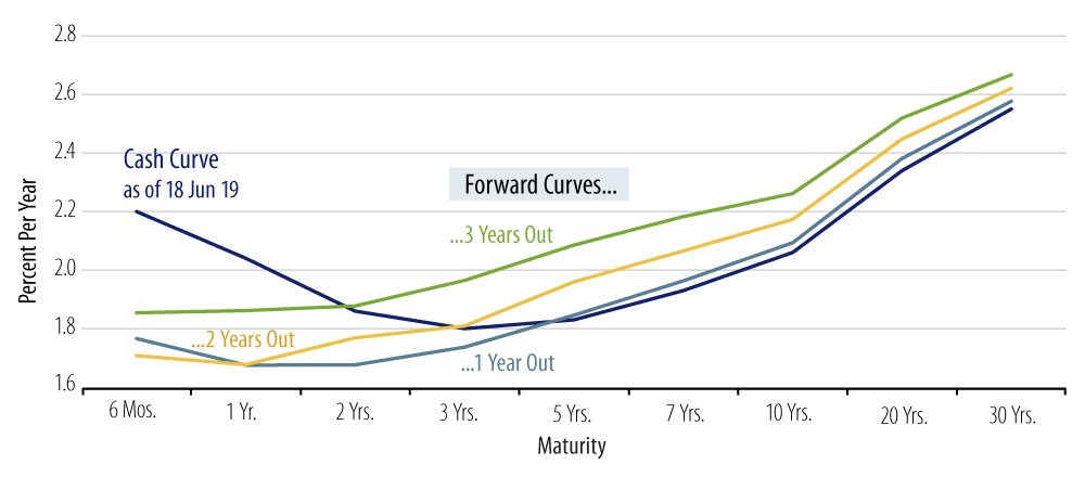
It might be that curve inversions presage recession so strongly because in order to produce a truly inverted yield curve, the markets would have to expect so pronounced and so prolonged a bout of Fed easing that only an imminent recession could justify so extreme a policy regime. If this is indeed the case, it is again doubtful whether current experience fits the bill. Exhibit 2 shows forward curves drawn off the current cash curve. Presently, not even the 1-year forward curve is inverted. While market pricing certainly appears to anticipate Fed easing soon, it does not appear to be looking for an easing sharp enough or protracted enough to constitute an anti-recession policy.
If curve inversion indicates a Fed policy that is oblivious to the chances of falling yields in the future—or whatever it is that is making the markets anticipate falling yields—then this explanation would seem to put the Fed at fault for every recession. Certainly, aberrant Fed policy can be blamed for many—even most?—past recessions, but not even the most ardent Fed hater would blame the Fed for every recession in memory. And when it comes to inversions predicting recessions, we are talking every recession, at least every US recession since the 1960s.
Which Inversion?
Exhibit 3 shows three different measures of the slope of the yield curve going back to 1950. As will be established below, our favored measure is from overnight yields to long bonds. As data on 30-year T-bond yields extend back only to 1977, we use an alternative measure of bond yields for pre-1977 history as well as more recently. That measure is a composite of all T-bond yields (T-bonds are defined as Treasury instruments with maturity greater than 10 years). This index is published by the US Treasury and extends back to 1919.
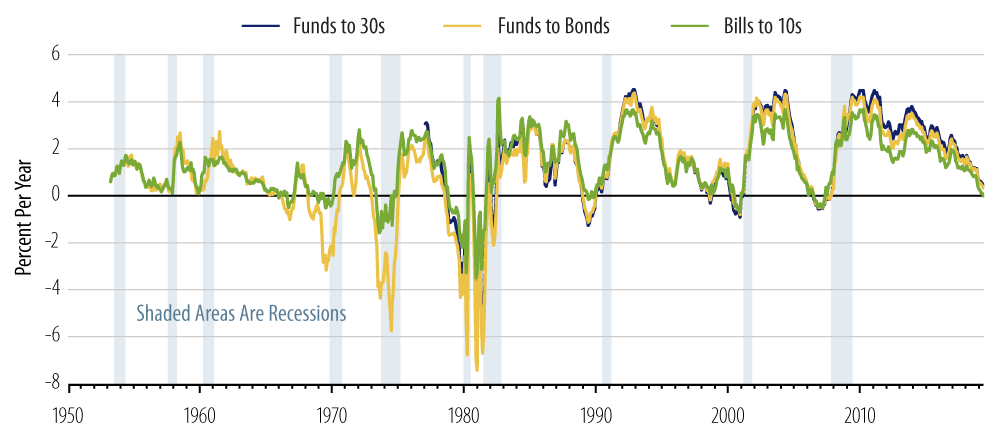
The blue line shows the “spreads” of 30-year yields over overnight yields (“funds-to-bonds”), the yellow line shows the spreads of composite T-bond yields over overnight yields, and the green line shows an alternative yield curve measure: 10-year T-note yields over 3-month T-bill yields.
As is clear from Exhibit 3, every recession since the mid-1960s has been preceded by inversions of all these yield curve measures, with “inversion” defined as a negative spread of longer-maturity yields over shorter-maturity yields. Conversely, every episode of yield curve inversion (but one) has been closely followed by the onset of recession.
Notice also that the funds-to-bonds measures have almost invariably been more negative prior to recessions than the bills-10s measure. In other words, the yield curve must also be inverted outside the 3-month-to-10-year maturity range in order for the total inversion—funds-to-bonds—to be more negative than that over bills-to-10s. This means that the yield curve inversions that have preceded recessions have generally been more pervasive than what we see presently. The only exceptions to this were the inversions of 2000 and 2006, where the “bump” from 10s to 30s prevented the bills-30s inversion from being more steep than that from bills to 10s.
Again, there is no cogent theory—as of yet—for why yield curve inversion should be so accurate a recession predictor. In the absence of such a theory as a guiding principle—and in order to avoid the false alarms that can occur when market vagaries work to invert a narrow portion of the curve—it makes sense to insist on instances of curve inversion that are pervasive enough to show up across the whole yield curve (and for them to look inverted).
Empirical work performed by the FRBSF and others claims to find that the 10-year/3-month spread works best as a recession indicator. Our analysis here indeed finds that measure to have correctly predicted every recession since 1960 and never to have predicted recession when none followed. But the same can be said for long bond yields over the fed funds rate. If both of these measures have perfect records, as they do, then any test that tries to distinguish between their respective performances is going to be on shaky ground. In statistical terms, such tests will be “low power tests.”²
A History Of Inversions
Exhibit 4 provides detail on individual cases of yield curve inversion. The charts show actual yield levels for funds and bonds in chronological order, with each recession again marked by light blue shading. Each chart generally covers at least a 15-year period, but some have been extended further in order to provide continuity for various episodes of inversion or business cycle behavior.
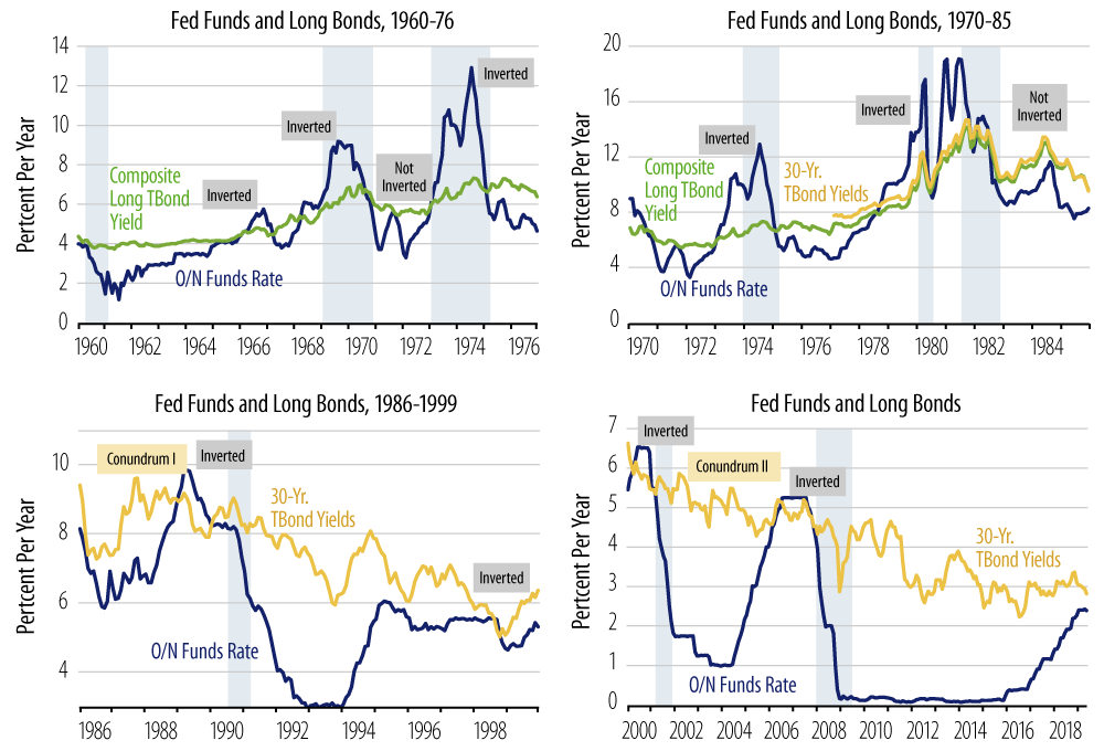
The first chart shows the one clear example where yield curve inversion did not presage recession: the credit crunch of 1966. This was the first episode in postwar history where the combination of Fed rate hikes and deposit rate ceilings constraining banks (the infamous Regulation Q) led to disintermediation of funds out of US banks into (unconstrained) Eurodollar markets, resulting in financial market stress. In that episode, the Fed quickly reversed course and eased enough to un-invert the curve before the economy faltered.
However, the resumption of policy tightening—in the face of rising inflation—in 1968 and later led to another curve inversion and recession soon after. Similar developments occurred prior to the onset of recessions in 1973, 1980 and 1981. The Fed worked to unwind yield curve inversion in 1989, but recession ensued anyway, in the summer of 1990.
Notice that the yield curve inverted very briefly and very mildly during the Russia/LTCM crisis of 1998, but the Greenspan Fed eased enough to unwind that inversion and forestall recession…until the curve inverted again in 2000, followed by recession in 2001. Given the slightness and brevity of the 1998 inversion and the fact that recession did ensue 30 months later, the 1998 inversion is not a clear case of failure of curve inversion to predict recession. Finally, the curve inversion of 2006-2007 was a garden variety yield curve inversion, albeit with a tremendous amount of financial disruption occurring subsequently.
Conclusions
Interestingly enough, through all these previous periods, curve inversions occurred with little fanfare. In most cases, the subsequent onset of recession was a surprise to the markets and to the Fed, despite the clearly inverted curves (by any measure) some months earlier. Both market analysts and the Fed appear to be learning from experience when they pay so much attention to possible curve inversion presently. Some of the increased attention also reflects the fact that the advanced age of the present expansion has led to increased attempts by various analysts to ferret out signs of recession.
Still, some thoughtfulness is warranted. Apart from its length, the extreme tepidity of the current expansion is its most compelling feature. Without excesses in the economy, there is less susceptibility to shocks than otherwise. Presently, there are no obvious excesses in economic—or even financial—activity that would make the present economy prone to recession, a condition quite different from those of 1980-1981 (rampant inflation), 1990 (S&L collapse), 2000 (Asia/Russia/LTCM/Y2K/tech bubble), or 2006 (housing bubble).
Consider the US manufacturing sector. In effect, manufacturing was in recession over 2012-2016 and has been rebounding out of that torpor for just a bit more than two years. From this perspective, it would be more apt to refer to manufacturing sector conditions as “early-cycle” rather than “late-cycle,” and the same description could also be applied to the overall economy.
Finally, again, we do not have a truly inverted yield curve at present. Certainly, the yield curve has flattened tremendously over the past eight years, with the spread from funds to bonds declining from over 400 basis points (bps) in 2011 to around 30 bps presently. And, yes, the curve is flat enough that a few more Fed rate hikes or a further, sharp rally in T-bonds could push the curve to a true inversion.
But, on these grounds, the recent change of heart by the Fed is a comforting development. If the Fed were to have followed through on its previously planned regimen of three or more rates hikes this year, the curve would most likely have become truly inverted. Instead, the Fed has ceased hiking, and present indications are that it will reduce rates soon.
One or two rate cuts should provide enough downward impetus at the short end of the curve to provide some upward slope there. Should bond yields decline further from here—unlikely but not impossible—more than two eases would be called for. Fed officials have rightly diminished the importance of the inverted portions of the curve that we now have in place. However, various Fed officials have acknowledged the potential importance of the signal given by a flattening/inverting yield curve and expressed intents to preventing a meaningful inversion from occurring. Along with the below-target inflation we have discussed recently, the interest in avoiding actual curve inversion is one more reason to expect concerted Fed rate cuts later this year.
- Least squares “trend lines” fitted to these curves confirm this assertion.
- Statistical tests of null hypotheses are calibrated on the probability of Type I error: how likely is it that we will reject the null hypothesis when it is true? The “power” of a test refers to the probability of Type II error: how likely is it that we will accept the hypothesis when it is false? The higher the probability of Type II error, the lower the power of the test. In this case, the null hypothesis of the FRBSF and others is that the 10-year/3-month spread is so superior to other yield curve measures that we can accept its recession signal even when other such yield curve measures, such as 30-year/funds, are signaling differently. Since, as stated in the text, both of these measures have perfect records over past history, the findings claiming efficacy for the 10-year/3-month spread will inevitably be low-power findings.